Multidimensional data often has a latent sequential structure that determines the basic shape of the data. Those sequential structure might correlate with ordered quantities like time, stages and size etc. Capturing and visualizing those sequential structure would be very helpful for exploratory data analysis.
A frequently used method for exploring high dimensional data is the principal component analysis (PCA). By projecting data to the main principal components, we can gain institutive information about the high level large scale shape of the data. More particularly, the projection to the first principal component offers a way to visualize the main back-bone linear structure.
A main short-coming of PCA is that it only structure from linear perspective. It fails for data whose latent sequential structure significantly deviate from linearity. For instance, let's consider the 2-dimensional data set depicted by the following map:
This dataset consists of multiple clusters each possesses, more or less, a sequential structure. The PCA wouldn't be able to aggerate these partial sequential structure to a global sequential structure.
The t-SNE algorithm with the high fidelity modification offers a simple yet effective way to discover global sequential structure in high dimension data: we simplify apply t-SNE to reduce a given dataset to 1-dimensional space. The coordinates of data points in the 1-dimensional space then provide the keys to order data points. The following video clip illustrates how t-SNE works on the dataset mentioned above:
We notice in above video that t-SNE discovered, more or less, the sequential structure underlying the sub-clusters; and furthermore, those partial sequential structures are aligned/ordered in a coherent way.
Dual Sorting of Heatmaps
Heatmap is a popular method to visualize matrix of numerical data. Heatmap is often used together with dendrograms, which rearrange the rows and columns using certain hierarchic clustering algorithm. The following picture shows a typical heatmap together with two dendrograms:
Heatmap augmented with dendrograms (wikipedia)
Heatmap constructed with dendrograms offers intuitive visualization, but it has difficulty to scale up to large dataset. For large matrix like those from single cell RNA sequencing (scRNA seq) study, dendrogram become quite inefficient, and instable in the sense that small change in data might lead to large variation in the clustering structure.
The t-SNE based sorting algorithm described in this note provides a simple alternative to arrange rows and columns in a heatmap: we simply sort the rows and columns with t-SNE. As an example, I took a dataset from scRNA Seq analysis, it comprises the gene expression counts of about 11000 cells with respect to 28000 genes. The following pictures shows its t-SNE embedding and its heatmap:
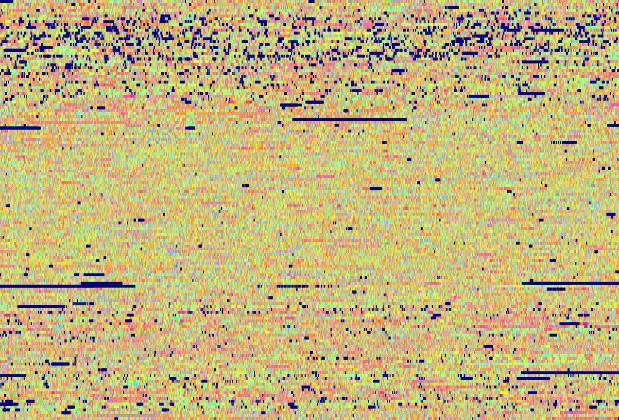
In above heatmap, each row represents the expression profile of a cell with respect to all selected genes; and each column represents the expression profile of a gene with respect to selected cells. Dark or red elements in the heatmap represent highly expressed cell/gene pairs. The t-SNE map is a embedding of all cells. We can see that several cell clusters are clearly visible as dark horizontal strips. However, no clear gene clusters are visible in the heatmap.
The following picture shows the heatmap after sorted its rows and columns with t-SNE. We see much more clearly the clusters among cells and genes, and more importantly the association between the cell- and gene-clusters.
It should be noticed with regards to the experiment above:
The perplexity of the t-SNE is set to about 2500. Smaller perplexity often leads to instability and random artifacts.
The training process with t-SNE has ran for 5000 epochs, which is much higher than normal t-SNE training process. Training less epochs likely results in more random artifacts.
In above example, t-SNE used the linear correlation as distance metric instead of the normally used Euclidean distance. Various experiments indicate that correlation seems to be more appropriate to measure similarity between genes. Because of this, we can not use PCA to pre-process data table to much lower dimensions to speed up the training, since PCA in general doesn't preserve correlation table.
Unfolding of t-SNE Embedding
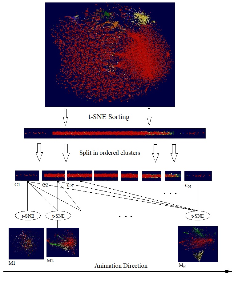
We have previously blogged about doing "knockout" test with t-SNE. By comparing the t-SNE maps produced by the different set of genes, we can explore the impact of disabled genes. Going one step further, with t-SNE as a multidimensional sorting algorithm we can perform the following experiment: We first sort all the participated genes into a sequence; then pick a particular direction for the sequence and split the sequence in small clusters; then create t-SNE cells maps with progressively larger gene clusters. The following diagram illustrates these steps:
It should be noticed that the sequence of t-SNE maps are generated independently by separate training processes, and each of them started from a different random initialization. In other words, the final maps M1, M2, M3 are independent embeddings of ordered gene clusters, C1, {C1, C2}, {C1, C2, C3}, etc.. If we are lucky, the order underlying the gene clusters might indicate certain latent variables, like time. The following short video clip shows the animation of through the resulting t-SNE maps for the dataset in previous section.
It is interesting to notice that the animation is reminiscent of group of cells unfolding, generation by generation, to final shape and structure.
High Fidelity t-SNE with Gradual Diminishing Exaggeration
When we repeat t-SNE on the same dataset with the same parameters, we may get different maps with noticeable random variations. This kind of randomness limits the accuracy of t-SNE algorithm as a visualization tool.
In this note we describe a simple yet effective method to improve the accuracy of t-SNE: Instead of switching the exaggeration rate at a fixed time during the training, we propose starting the training process with a high exaggeration, say 12.0, then gradually reduce it to 1.0. We will demonstrate the effectively of this method with example from single cell RNA sequential study.
Post-Training Normalization
Since the cost function optimized by t-SNE is invariant under rigged transformations (i.e. rotations and shifting), t-SNE normally produced maps with random rotations and shift. These kind of randomness can be easily removed by post-training normalization. For this study, we propose the following steps to normalize t-SNE maps as illustrated in the following diagram with 4 sample t-SNE maps:
As shown in above diagram, a t-SNE map is normalized in 3 steps:
Centralizing: centralizing the map so that each of the 2D or 3D coordinate has zero-mean.
PCA based Alignment: Rotating the map, so that the x-axis aligns with the first eigen vector of the map; y-axis with the second eigen vector, and potentially the z-axis with the third eigen vector.
Moment based Flipping: Calculate the 0.5-th moment of the map along the x-axis according the following forms:
If the moment is negative, flip the map along the x-axis by multiple all x components with -1.0; Do the same with y-axis and potentially z-axis.
After normalization we can then measure the discrepancy between two t-SNE maps by summing up the Euclidean distances between the data points in both maps. For more convenience, we can just count number of the data points whose images points have distance from each other larger than certain values, say 40 pixels.
It should be pointed out that there are cases that the suggested method might fail. For instance, when the t-SNP maps are rotational symmetrical where no clear orientation is present, this method will have difficulty find common orientations. In the practice, we often encounter this case, when the perplexity parameter of t-SNE is too small, so that the resulting t-SNE map resemble a disc or a ball. Fortunately, this kind of issue can be easily fixed by increasing the perplexity.
Finally, it is interesting to notice that there is no need to scale the maps, since t-SNE with fixed parameter settings normally produces maps with roughly the same size.
Training with Gradual Diminishing Exaggeration
In order to improve the training speed and efficiency, t-SNE algorithm initially proposed to start the training with a high exaggeration factor, train the map for certain number of epochs; then switch the exaggeration factor to 1.0 to practically terminate the exaggeration phase. The following diagram shows the cost minimized during a typical t-SNE training process, the diagram has been overplayed with the exaggeration factor.
We see that the objection cost has been reduced rapidly for a short period after the exaggeration phased has ended, but then stayed basically unchanged during the rest of the training process. This behavior suggests that real learning only takes place when exaggeration factor changes. We propose thus the following function to gradually decrease the exaggeration factor:
In above formula, f(n) is the exaggeration factor at n-th training epoch; C is the initial exaggeration factor; N is the number of total training epochs; L is the length of exaggeration phase which is set normally to 0.9N.
Example
As example I picked a dataset from single cell RNA sequence (scRNA seq) study. The dataset contains the expression counts of about 22000 cells with respect to 28000 genes. The input data for the t-SNE is thus a 22000x28000 matrix. The following picture shows a heatmap and a t-SNE map of this dataset:
For the test, t-SNE has been run on the dataset 4 times with and without enabling the new exaggeration method. The following pictures shows the cost reduction during training of the four repeats:
We see that, with the new method enabled, the final t-SNE maps have consistently lower cost. We also notice that, with the new method, the final maps have almost equal costs, whereas with old method, the cost of final maps vary slightly. Those small variations are more visible in the final maps. The following two pictures show the maps created with and without the new method:
With some effort we can discern relative large variation amount the maps created with old exaggeration strategy. We can visualize those variations more clearly with animation by interpolation between those maps as be shown in the following video clip:
Knockout Test with High Fidelity t-SNE
Knockout test has been used in microbiology to probe gene functions during the development of organisms. For doing that, certain genes are disabled or knocked-out; and changes induced in the organism give indications about those knocked-out genes. In general, knockout test help us to trace the correlation between genotypes and phenotypes.
High fidelity t-SNE enables us to probe the effect of individual features on the output t-SNE maps. If consider the t-SNE maps as phenotypes derived from genotypes (i.e. gene expressions), we can perform kind of "knockout" test with t-SNE: We create first a t-SNE map with all features; then create a t-SNE map without certain features. We can then expect that the knocked out features would be responsible for the variation in the t-SNE maps.
The following short video demonstrates how "knockout" test might been done to study correlation between gene- and cell-clusters:
Conclusion
With a small change in its algorithm, t-SNE achieved much high accuracy and opens therefore doors for new applications.
Single-cell RNA sequencing (scRNA-seq) is a powerful tool to profile cells under given condition with respect to selected genes. As a contingency matrix, a scRNA-seq dataset records the the expression level of individual cells with respect to a set of genes or related transcriptical signatures. A widely used method to study such scRNA-seq data is embedding the expression profiles of cells, i.e. rows of such expression matrix, into low dimensional space, and visualizing them as 2D or 3D maps. Those maps offers an intuitive way to trace the phenotype clusters among cells. Yet, this kind of maps do not show the which cells are regulated by which genes, despite that the expression matrix is direct information about reglating relationship between cells and genes.
This note puts forward a method to embed expression profiles of cells and genes, ie rows and columns of the expression matrix, simultaneously into a single low dimensional space. The resulting map visualizes both cells and genes; and more interestingly, also the association between the clusters. The following diagram illustrates the relationship between the dual embedding and conventional embedding:
The dual embedding method uses the tSNE algorithm for the embedding. In particular, let C and G denote the set of cells and genes; dc and dg be distance functions over C and G respectively, With tSNE we can then obtain a cell map and a gene map from (C, dc) and (G, dg) respective as indicated in above diagram. As an extension to these methods, the dual embedding method embeds both C and G in to low dimensional space with tSNE. In order to do so, we define a distance function dcg over C⋃G as following:
In above formula, M is the expression matrix of the scRNA-seq dataset; M[x,y] stands for the expression level of x-th cell w.r.t. y-th gene; Mmax is the maximal element of M;h is a positive bias factor that additionally adjusts the distances between cells and genes.The last two terms in above formula define the distance between C and G in the sense that higher expression level between cells and genes will leads two lower distance. Additionally, larger bias factor h leads to larger separation between cells and gens.
As an example, I used a dataset with 12000 cells and 8000 genes from the data used in the publication tasic2018. The follow image shows a cell-genemap of this dataset. The expression matrix has been log-transformed; the perplexity for the tSNE algorithm is about 1000.0.
As a feature of embedding maps, we can expect that two closely located genes/cells have similar expression profile. Additionally, a gene (red dot) should have high expression level on closely located cells (green dots). As the cells and genes overlap each in the map significantly, the following image uses gif animation to blend-in the two groups successively into foreground.
Figure 1: Dual Embedding of cells and genes with tSNE Algorithm.
We notice here that the cells show a clear cluster structure, whereas the genes are rather less structured, except that a large gene clusters located on the far right side, those genes might be less relevant for the formation of these cells.
We also notice that, as shown in the following image, there are 4 or 5 cell clusters on the upper right corner whose nearby genes form a kind of sequential path. Those genes might play a special role in regulating those target cell clusters.
Embedding with Correlation Affinity
Notice that scRNA-seq datasets are basically contingency table of counts for cell/gene co-expression events, thus the nature of an expression matrix is more probabilistic, than spatial. For this reason, we purpose here a correlation distance for the embedding algorithm to replace the Euclidean distance.
More particularly, let M' be the row-normalized version of M as defined by
M'[x,y] := (M[x,y] - M[x, *])/||M[x,*]||
where M[x, *] and ||M[x,*]|| is the mean value and the norm of the x-th row of M respectively. Similarly, let M" be the column-normalized version M as defined by:
M"[x,y] := (M[x,y] - M[*,y])/||M[*,y]||
After the normalization, the correlation coefficient between two rows or two columns of M is just the scalar product the corresponding rows or columns in M' or M''. We now define our correlation distance pcg over C⋃G as following:
The operator ⦁ in above formula denotes the scalar product of two row or column vectors; h is as before a positive bias factor that additionally adjusts the distances between cells and genes. The default value for h is 1.0. Notice also that matrix M doesn't need to be log-transformed like the case for Euclidean distance function as the normalization scale the numbers in to common ranges.
As an example, the following picture shows the dual embedding of the data used in previous example by applying tSNE with the correlation distance pcg:
Figure 2: Dual Embedding of cells and genes with tSNE and correlation distance pcg.
Comparing to Figure 1, we notice that in this dual embedding, the genes show more clear and simple cluster structure; and there are much less overlapping between the clusters, albeit that quite some clusters intertwine with each other. In general, a dual embedding map has the property that genes are highly expressed in by nearby cells. As be shown in Figure 2, we can see that the most high density gene clusters are rather distant from the major cell clusters, this indicates that the majority of those genes probably don't participate in the cell regulation.
Dual Embedding with Eigengenes
Mathematically, eigengenes are the top principal components of the expression matrix with the largest eigen-values. Eigengenes are normally obtained with the SVD or PCA algorithm, they are widely used as a way to reduce the dimensionality of a dataset, and therefore reduce the complexity of calculations.
We can apply the dual embedding method to eigengenes to visualize their relationship with the cell clusters. The following picture shows a dual embedding of the cells of above example together with their 50 eigengenes, represented in purple color. We notice that the cells in this map form a similar cluster structure as that in Figure 2; whereas the genes are replaced by eigengenes in the neighborhood of the cell clusters. We can clearly see that most cell clusters are regulated by 2 or 3 nearby eigengenes.
This visual characteristics indirectly validate the correlation based distance as a proper choice for the dual embedding algorithm.
Conclusion
We have introduced a correlation based distance function for cell and gene expression profiles. With help of an embedding algorithm, like tSNE, we can obtain low dimensional map for both cells and genes. These dual embedding maps, not only shows the cluster among cells and genes, but also their correlation through their proximity in the maps.
As demonstrated with real examples, correlation in the sense of statistics seems to be a better metric to visualize events of different nature like cells and genes in the scRNA seq dataset; and in general large contingency table of counts. The dual embedding provides intuitive way to visualize and explore those data.
All simulations and examples in this note is done with the software package VisuMap and a custom plug-in module named Single Cell Analysis, which implements in particular the two distance functions described in this note. The plug-in can be downloaded and installed from VisuMap online.
Representation Learning for Algebraic Relationships
This note puts forward a simple framework to learn data representation with deep neural networks. The framework is inspired by mathematical representation theory where we look for vector representations for elements of algebraic structure like groups.
To describe the framework, let's assume that we have the following table for an abstract operation:
Table 1: Binary operation table for abstract items a, b, c and d.
Above table shows that the abstract entities a, b, c and d fulfill an abstract operation ⊕, for instance: a⊕a = 0; b⊕c = 3; etc.. We now try to find representations for a, b, c and d with two dimensional vectors. In order to do so, we start with a default zero-representation as in following table:
a:
(0, 0)
b:
(0, 0)
c:
(0, 0)
d:
(0, 0)
Table 2: Initial representation table for a, b, c, d as 2 dimensional zero vectors.
That means a, b, c and d are all represented by vectors (0, 0). We then construct a feed-forwards neural networks as illustrated as following:
The network has four input nodes to accept a pair of 2-dimensional vectors; and one output node to approximate the operation ⊕. Like conventional feed-forward neural network, the input and output nodes will get data from the operation and representation table before each optimization step. Unlike the conventional feed-forward network, the input nodes are configured as trainable variables which will be adjusted during the learning process; and their values will be saved back to the representation table after each learning step. More particularly, the learning process goes as follows:
Randomly select a sample from the operation table, say b⊕c = 3.
Lookup the representation for a and b from the representation table. Assign them to input nodes of the network. Lookup the expected output for b⊕c from the operation table, and pass it to the output node as learning target.
Run the optimization algorithm, e.g. the ADAM optimization algorithm, for one step, which will change the state of input nodes to new values b'0, b'1, c'0 and c'1.
Save b'0, b'1, c'0 and c'1 back to the representation table as new representation for b and c.
Continue with step 1.
With an appropriate choices for the network and training algorithm, the above training process will eventually converge to a representation for a,b,c,d, so that the network realizes the abstract operation as described in table 1. A tensorflow based implementation of above training process is available at Z4GroupLearning, which can be run on the google cloud computing platform from a browser.
Representation Learning for Transformations
In previous example the table 1 actually describes the finite group ℤ4, representation are linked to the input layer. In general, the framework is not restricted to binary operations and the representation vectors can be linked to any state vectors, i.e. weights, bias and other trainable variables, of the network.
For the demonstration we describe here a network that finds representation for transformations in the 3D space. Let's assume that X is a 1000x3 table consisting of 1000 points from a sphere in the 3-dimensional space. Let {T0, T1, ...} be a sequences of 3D-to-3D transformations which transform X to {Y0, Y1, ...}. Assuming that X and {Y0, Y1, ...} are known, we can then find representations for the transformations {T0, T1, ...} with a deep neural network as illustrated as following:
The transformations are linked to some internal part of the weight matrix. Before starting the training process, the transformations are initialized with zero-matrices with the same shape as the linked weight matrix. At each training epoch, a 3-tuple (X, Tt, Yt) is randomly selected; Tt is pushed to the linked weight matrix; then the optimization process is run to learn the map X-to-Yt mapping; After the optimization process has run for several loops for all data points in X and Yt, the linked weight matrix is pulled back in to the representation Tt, stored as T't for future epochs. The training process then continues with other randomly selected 3-tuples, until all Yt have sufficiently approximated by the network.
As an example, we have selected 30 linear translations and 30 rotations to transform the sphere in the 3D space. The following video clip shows the transformed images Yt:
After the training process has completed after about 100 epochs, we have got 60 matrices as representation for the transformations. We have embedded the 60 matrices into the 3-dimensional space with PCA (principal component analysis) algorithm. The following picture shows the embedding of the 60 transformations:
In above picture, each dot represents a transformation: a red dot corresponds to a linear translation, a yellow dot to rotation. We see that the representations generated by the deep neural network correspond very well the geometry structure of the transformations.
Representation Learning for Dimensionality Reduction Representation learning (RL) described here can be used to perform non-linear dimensionality reduction in a straightforward way. So for example, in order to reduce a m dimensional dataset to k dimension, we can simply take a feedforward network with k input nodes and m output nodes. As depicted in the following diagram, the input nodes are configured as learning nodes whose state values get values from the training data and adjusted during the learning process.
We notice that autoendcoder (AE) networks has often be used in various ways for dimensionality reduction and unsupervised learning. Comparing to AE, RL basically performs just decoding service. However, the essential difference is that the AE trains a network, whereas RL trains directly the lower dimentional representation.
The following maps shows an example of mapping a 3-dimenional sphere dataset to the 2 dimensional plane. An implementation with tensorflow on colab platform can be found here.
We notice that 2-dimenional map preserved large part of the local topology, while unfolding and flattening the 3D-sphere structure.
If encoding service (like that in AE) is needed, we can extend the above RL network with an encoding network that maps the network output to the lower dimensional data. This encoding network can be then trained independently from the decoding part, or concurrently with the decoding network part.
Application for Data Imputation in Epigenomics Epigenomic study shows that different cell types of multi-cellular organisms developed from a common genome by selectively express different genes. Many types of assays have been developed to probe those epi-genomic manipulations. The result of such an assay is normally a sequence of numerical values profiling certain biochemical properties along the whole genome strand. With a set of assays and a set of cell types we can then obtain a profile matrix as depicted as following:
Table 3: Profile matrix for cell and essay types.
A large profile matrix about various cell types can help us to understand the behaviors of those cells. However, it is currently rather expensive to conduct essays in large numbers. To alleviate such limitations, researchers have tried to build models based on available data, so that they can impute profiles for news cell types or essay types (ChromImpute, AVOCADO, PREDICTD, Encode Imputation Challenge,)
We see that table 3 has similar structure as table 1, thus we can model table 3 similarly as table 1. We notice here two main difference between the two tables: Firstly, table 3 is only sparsely defined as only limited number of experiments have been done. Secondly, an element in table 3 is a whole sequence (which may be potentially billions of numerical values.), whereas an element in table 1 contains a single value. It is obvious that the training algorithm for table 1 can handle the data sparsity problem without any change. In order to obtain representation for each cell and assay type, we only have to make sure that each row and each column contains some defined profile data.
In order to address the high dimensional data issue, we extend our neural network as depicted as following:
Figure 1: Neural network for cell- and assay-type representation learning.
The training algorithm runs roughly as following:
Randomly select a profile from table 3, say a profile P(A, b) for cell-type A and assay type b.
Segment the profile into sections of equal length N; and arrange the sections into a matrix PA,b that has L rows and N columns.
Lookup the representation RA for cell type A in present set of representations. If no such representation is found, initialize RA as a zero-matrix of dimension LxDc, where Dc is a preset constant.
Lookup the representation Rb for assay type b in present set of representations. If no such representation is found, initialize Rb as a zero-matrix of dimension LxDa, where Da is a preset constant.
Randomly select an integer k between 0 and L; Push the k -th row of RA and Rb into the input layer of the network; Run the optimization process, e.g. with ADAM optimizer, for one step with k-th of PA,b as the target label.
Pull back the state of the input layer into the k -th row of RA and Rb respectively.
Repeat the steps 5 and 6 for certain preset numbers.
Select an other profile and repeat step 1 to 7 till the training process converges to certain state with small errors.
Notice that the network depicted above consists mainly of dense feed-forward layers. Only the last layer is a transposed convolution layer. This layer significantly extends the output dimension and therefore speedup the training process for long profile sequences. Another technique to speedup the training, that is not directly visible in above diagram, is the batched learning: the training process updates the weight matrix and input layer states only after 30 to 40 samples have been feed into the algorithm.
Representation Learning versus Model Learning
Most deep learning frameworks are model learning in the sense that they train models to learn data. Compared to the amount of training data, the size of the trained models are relatively small. RL extends model training to learn vector representation for key entities, which subject to certain algebraic relationships. Those key entities can be, element of mathematical groups, 3D image transformation, biological cell and assay types. Since RL exploits modeling power of deep neural network in the same way as model learning does, methods and techniques developed for model learning (like data batching, normalization and regularization,) can be directly used by RL framework.
It is interesting to notice RL incidentally resembles the working mechanism in cellular organism as revealed in molecular biology. In the latter case, the basic machinery of a cell is the RNA ribosome, which is relatively simple and generic compared to the DNA sequences. The ribosome could be considered as a biological model, whereas the DNA sequences as representation (i.e. code) for plethora of organic phenotypes. The learning process of the two models are however different. Whereas the ribosome model learns by recombination and optimizing selection, RL learns by gradient back-propagation. The former seems to be more general, whereas the latter be more specific and, arguably, more efficient. Nevertheless, I do think that nature organism at certain level might host more efficient gradient directed learning procedure.
Conclusion
We have presented a representation learning method with deep neural network. The method basically swaps the data representation with states of neuron nodes during the training process. Intuitively, those learned representation can be considered as target data back-propagated to designated neuron nodes. With examples we have demonstrated that RL algorithm can effectively learn abstract data like algebraic entities, transformations, and can perform services like dimensionality reduction and data imputation.
Overfitting is a key characteristic for regression style data modeling with deep neural networks. Whereas considerable effort have been devoted to finding methods to reduce overfitting, little have been done to address the question how to measure overfitting. In most cases, overfitting is measured by prediction error with respect to a pre-selected test data set. Such method has led to various, more or less, successful overfitting-reducing techniques.
There are, however, some open questions relating to the rather ad hoc method to measure overfitting. Firstly, the method requires that the test set does not participate in the training process. But most learning process checks repeatedly with the test data set to find optimal models or meta-parameters. In this way, the test data set information "leaks" in to the training process and compromises the separation between training and testing data set. Secondly, there are no clear guidelines to choose the test data set. The method implicitly assumes that the randomly selected test data set will reflect the intrinsic statistics of data model, such assumption can be far from being true in the practice. Thirdly, many problem encountered in the practice have rather limited data, reserving part of the data as test data set might significantly reduce the size of the training data set, and therefore reduce accuracy of regression.model.
In this note I'll present a simple way to quantify overfitting of regression style neural networks. The main idea of the method is that it generates test data by linear interpolation, instead of choosing test data set from training data. The following diagram illustrated in this method:
Strip Overfitting with respect to point A and B.
The above diagram shows a neural network involved in learning a map from high dimensional data set to the 2-dimensional plane. After completed the learning process, the network maps the two data points labeled A and B to A' and B', respectively. In order to measure the overfitting, we choose 3 evenly distributed linear interpolation points between A and B; and calculate their targets in the 2 dimensional plane with the learned network. Whereas A, P1, P2, P3, B form a straight line, the points A', P'1, P'2, P'3, B' normally don't form a straight line. We then define the strip overfitting w.r.t. A and B by the size of the strip induced by the points A', P'1, P'2, P'3, B', as depicted in above diagram as the shadow area.
Based on the strip overfitting for a pair of data points, we can then estimate the overfitting for the whole training data set by the average strip overfitting for a fixed number of randomly selected data point pairs.
It should be noted that the number of interpolation points provides a way to control the scaling of the overfitting: the more interpolation points we choose, the finer the strip and the smaller the strip overfitting. When the target space is a one-dimensional space, the strip will collapses to a straight line and always have size zero. In order to accommodate such special case, we append an index component to each value in the series A', P'1, P'2, P'3, B', so that we get a series of two dimensional vectors (A',0), (P'1,1), (P'2,2), (P'3, 3), (B', 4); and we define its strip size as the strip overfitting for the one-dimensional target space.
It should be noted that the strip overfitting also becomes zero, if the mapping induced by the network preserves straight lines between the data points. That means, linear regression would be considered as kind of ideal regression with zero overfitting. Since most data models in the practice are non-linear, zero strip overfitting won't be achieved globally for all data point pairs.
The interpolation technique also provides a direct way to visualize data generalization. In order to see how a neural network generalizes, we can choose two data points and calculate a series of interpolation points between them; and then plot their trace mapped in the target space by the network. As samples, the following two pictures show the traces of three pairs produced by two differently trained neural networks: both networks have the same structure and are trained with the same algorithm, the only difference is that the network that produces the left picture has used the dropout regularization technique to reduce overfitting. We see clearly that the three interpolation traces on the left side are closer to straight lines. Numerical calculation also verifies that the network for the map on the left side has smaller strip overfitting. This example indicates that strip overfitting as defined in this note may be suitable to characterize overfitting phenomena.
The next two pictures show more examples of interpolation traces that visualizes the effect of dropout regularization technique. These two pictures are produced by the same two networks used before with the exception that here more data point pairs have been chosen and the training data points are not shown for the sack of clarity. We see that the dropout regularization makes the interpolation traces smoother and more homogeneous.
Discussion
This note has introduced the concept strip overfitting to quantify overfitting in multidimensional regression models. The method basically quantifies overfitting by the "distance" between a regression model and the linear interpolation. We have demonstrated with examples that the strip overfitting may be suitable to measure and compare the effect of regularization techniques like dropout technique. The strip overfitting offers an interesting alternative tool to quantify and visualize overfitting in neural networks for multidimensional data modeling.
Line chart is a popular technique to visualize trend among sequential data. Whereas it has been very a useful tool in general, it has a often neglected problem for large data sets: most conventional software library draw curves sequentially in certain order, so that the early drawn curves will be covered by curves drawn afterwards. This means that the appearance of the line chart depends on the drawing order, that is often random in the practices. The following animated picture illustrates a case where yellow curves get covered by blue curves. This drawback would especially become more apparent for large data set that comprises many high density curves.
In this note I'll present a new line chart method that avoids the above mentioned problem. Before we describe the new drawing method, let's recall a simplified version of the conventional way to draw line chart:
Input: A set of line segments each with 2 ending points and a color. Output: A bitmap P with a color Pxy at each coordinator (x, y). Initialize P with the background color. for each line segment L Let (r, g, b) be the color for L for each pixel coordinator (x,y) on L Set Pxy:=(r,g,b)
The above algorithm is a single pass drawing method where each pixel color of a line segment is directly painted on the bitmap. With this method, painted lines on the bitmap may potentially be painted over by successive lines.
The new method is a two-pass algorithm: it first sum up all pixel colors in an intermediate matrix; then convert the matrix into a bitmap. It works roughly as follows:
Input: A set of line segments each with 2 ending points and a color. Output: A bitmap P with a color Pxy at each coordinator (x, y). Initialize a matrix M with the same dimension as P, but each component of M holds an integer vector Mxy=(r,g,b,n). for each line segment L Let (r, g, b) be the color for L for each pixel coordinator (x,y) on L Set Mxy := Mxy + (r, g, b, 1) for each coordinator (x,y) in M Set Pxy := (r/n, g/n, b/n), where (r,g,b,n) is the vector Mxy
Compared to the previous method, the key change of the new method is the use of an intermediate matrix : the matrix sums up all colors from all lines and counts how many times a pixel has been painted. In the second pass, the matrix is converted to bitmap by taking the "average" color for each pixel. It should be pointed out here that, for an actual implementation, the data type for matrix components should be all 32 bits integers, so that no data overflow occurs when summing up the colors.
The following picture shows a line chart created with the new line chart algorithm for the same data used in previous picture above:
We see in above picture that the group of yellow curves are clearly visible. In general, the new line chart will reveal groups of curve, as long as the group is statistically significant with respect to the complete data set. The conventional line chart, on the other side, only shows curves on the "surface" of the curve bundle.
The new line chart algorithm has another significant advantage over the conventional line chart: since the algorithm does not mandate particular order to update the matrix and bitmaps, it can be efficiently parallelized on modern GPU hardware and achieve very good performance. The implementation included in VisuMap version 5.0.930 is, for a system with a GTX 960 card (that has ca. 2000 GPU cores), more than two orders of magnitude faster than the conventional line chart.
Data profiling are normally understood as statistical methods to extract numerical features from complex systems for easy exploration. So for instance, GDP, CPI and various kind of indices are often used to profile the state of an economy. Appropriate profiling helps us to compare similar systems; or a system in different development phases. In this note I'll put forward a generic method to profile high dimensional data; the method combines dimensionality reduction algorithms with deep artificial neural networks.
In recent years, many so called nonlinear dimensionality reduction (NDR) methods have been developed to visualize high dimensional complex data. Those methods often use machine learning algorithm to produce 2D or 3D maps; which provide a kind of graphic profiles about data. For instance the following pictures shows a 2D map made from a data set from flow cytometry study:
Above map was made with the tSNE algorithm from a dataset that contains about 6000 data points each with 12 variables; The colors for the sub-clusters are added with help of the affinity propagation clustering algorithm. The colored map is pretty helpful to discern interesting structure within the data set. Unlike those statistics based profiling, the visual map based profiling does not rely on high level features like GPD ratio; which in general require a good understanding about the data and underlying system.
Nevertheless, those visual map based methods lack the predication capability in the following sense: in the practice, we often have multiple data sets collected about similar systems, or the same system in different phases. For instance, in clinic trials our data sets might be gene expression profiles of patients in different trial stages. In these cases, we are especially interested in differences between the profiles. Most of these NDR methods are however insensitive to small changes, so that it is hard to recognize differences between NDR maps from similar data sets.
To address above mentioned problem, we purpose here the deep data profiling (DDP) procedure as an extension to NDR based profiling as illustrated in the following diagram:
Deep Data Profiling
The DDP procedure starts with a set similar data sets. As first step we choose a reference data set and apply NDR on the data set to obtain a 2D or 3D map. Many NDR methods are available for this purpose, for this note we recommend the tSNE algorithm, as it is widely available and produces relatively good structured map for a wide range of data. Then, we apply a clustering algorithm on the map to produce labels for the sub-clusters on the map. Those labels are then used as different colors for the sub-clusters, so that we get a colored map as illustrated in above picture.
There are many clustering algorithms suitable for this purpose, for this test we used the affinity propagation algorithm together with some manual adjustment directly performed on the map.
The colored map we obtained from the reference data set represents knowledge we captured from the reference data. As next step we then use a machine learning algorithm to learn such knowledge. In particular, we employ multilayer feed forwards networks to learn the translation from reference data to the colored map. Two networks will be used for this purpose: one to learn the dimensionality reduction function; and the other one to learn the clustering function.
The two trained networks can then be applied to other data sets to produce colored maps as their visual profiles.
A plugin module, called Data Modeling, has been implemented to integrate DDP service with VisuMap version 5.0.928. The plugin module internally uses the TensorFlow engine from Google Inc. to implement feed-forward neural networks. The plugin offers GUI and scripting interface to train and apply models with data directly from VisuMap. The following screen-cast demonstrates a simple use case of DDP with VisuMap:
Deep data profiling procedure presented here offers a visual profiling technique for high dimensional complex data. Compared to conventional statistics based profiling techniques, DDP is more intuitive and information richer. As an meta-algorithm, DDP can take advantage of new algorithms for NDR, clustering and machine learning. With the rapid development of machine learning technologies, DDR might offer powerful and versatile tools to explore high dimensional complex systems.
Genomes of multi-cellular organism often contain short sequences with many duplicates which have been created and preserved with minor mutations during their evolutionary processes. Those nucleotide sequences, called here generically motifs, carry important information about the structure and history of those genomes. Better understanding of those motifs could help us to explore the function and evolutionary path of genetic code.
In this note I'll put forward a method to visualize motifs as 3D dotted maps, where each motif is represented by a dot in the 3D space; and sub-groups of motifs may take different shapes, which I'll try to interpret in terms of evolutionary variations.
I have put forward some methods to visualize DNA sequence a while ago. In those early attempts, different scanning machines were used to extract high dimensional vectors from DNA sequences; which are then mapped into 3D space with multidimensional scaling algorithm. A main problem of those methods is that they are often not very sensitive towards sequential variations, so that the resulting maps lack capability to reveal structural information. The method presented here basically follows the same framework, except that we'll not use scanning machine, but feed the motif sequences as data points directly into the multidimensional scaling algorithm which uses the neadleman-wunsch algorithm to calculate the editing distance between the motifs.
In the following I'll use the chromosome I of Caenorhabditis Elegans as an example to detail the steps of the visualization process.
Firstly, I downloaded the sequence of chromosome I of C. Elegans from the NCBI site (NC_003279) I then created an blast database for the chromosome with the makeblastdb program; then I used the blastnprogram to query on all sub-sequences of length 30 nucleotide bases; A sub-sequences will be recorded as motif, if it has more than 30 duplicates on either strand of the chromosome, where a fuzzy matching with one or two mutation or deletion/insertion are employed. In this way 4578 motifs have been found among the chromosome I that has length of about 15 million nucleotide bases. The following picture shows the distribution of these motifs on the chromosome:
In above picture nucleoside types A, C, G, T are shown by color yellow, magenta, red and cyan respectively; The locations of motifs are marked by blue bars. We notice that many motifs overlap each other. Those overlapping motifs are merged together to form the 4578 disjunctive sequences of different length as be shown in following table:
I then apply the t-SNE algorithm on these 4578 motifs to create a 3D map. I used needleman-wunsch algorithm to calculate the minimal editing distance between the motif sequences. The needleman-wunsch algorithm uses a simple penalty schema of (2, 0, 1) for gape, match and mismatch respectively. The following picture shows the resulting 3D dotted map:
Then a clustering algorithm (a combination of k-mean algorithm and mean-shifting algorithm) is applied to the 3D map that results in coloring of major clusters with different colors. With some minor manual color adjustment, we obtained a colored 3D dotted map as shown in the following animation:
From the above map we can roughly find clusters of the following shapes:
Assuming that all motifs are created by duplication and random single nucleotide mutations, we could interpret above shapes as following: Motifs form shape of small blobs indicate those motifs originated from a common ancestor and have undergo minor mutations. Those motifs could be either recent duplicates, so that they don't have time to accumulate large number of mutations. Or, if they exist for long time, their mutation with large number of mutation did not survive the evolutionary selection process.
Motifs form the shape of curves indicate that those motifs, originating from a common ancestor, have mutated gradually away from its initial copy. With help of VisuMap software we can locate those motifs in the chromosome and trace their evolutionary process along the curve ( but we cannot say which end of the curve is the starting end.) The following pictures show a case with a curved motif collection:
In above pictures, the top picture shows a section of the 3D motif map; the second picture shows corresponding locations of those motifs on the chromosome. With VisuMap you can interactively move the selection of motifs in the window displaying the first picture, so that the second picture will mark the location of selected motifs. The last picture shows the nucleotide sequences of these motifs, one motif per row, in the order along the curve from left to right. We can see that these motifs gradually shifted their phases.
We notice some curved motif groups have small blobs attached to them. These blobs might indicate short bust of different mutations.
Interestingly, we see two motif clusters in the 3D map which form roughly two parallel rings. Those motifs are distributed across the whole chromosome, they may have some internal relationship, but I'm not sure in moment how to interpret them in terms evolutionary process.
In addition to C. Elegans, I also applied the visualization algorithm to other organisms. The following short video clips shows several motif maps of the rice and human genome:
It should be noted that for the human chromosomes, calculating the motif map with the current implementation for all motifs would be computationally prohibitive. So, I used a simplified version of blastn; and selected three small sub-sets, each with about 20 000 motifs, for above motif maps. The three sub-sets have increasing duplicate frequencies. So, for instance, motifs of the third set all have over 10 000 duplicates; whereas the first set has motifs with 300 to 500 duplicates.
From above maps we can see that the motifs of rice genome are much less structured: almost all of them are just small blobs. Those motifs are, unlike the case with C. Elegans, mostly located in coding area. On the other side, the motif map of the human genome shows diverse structures depending on the duplicate frequencies; and the third motif map evens shows some kind of 2-dimensional structure.
Discussion
The visualization method presented here provides a simple way to extract geometrical models from pure discrete genetic sequence information. These geometrical shape provide intuitive information about the evolutionary path of genetic code; and they might be helpful to profile and explore whole genome structures.
The method presented here has three key components: the way to find motifs; the way to calculate editing distance and the multidimensional scaling algorithm (MDS). Each of these three methods has significant impact on the results and they also pose significant limitations. For instance, the current implementation of these components are quite slow, so that it is difficult to visualize large motif sets. I have experimented with other editing distance, like the smith-waterman and levensthein method, they seem to perform similarly, needleman-wunsch just produces slightly better visualization. For the future investigation we might work on finding more efficient MDS algorithm or finding more efficient distance metric to help us to attack much larger and different groups of genetic code.
I have just released VisuMap version 4.7 on our web site. Apart from many GPU related optimizations of 3D data visualization, this release includes a heat map style data view to visualize long discrete sequences. A whole genome with billions of nucleotides can be aggregated and displayed in a single 2D map. The following screen snapshot shows, for example, the exome distribution of the first human chromosome:
We notice that most genome browsers current available are depth oriented: their exploration are normally focused on relatively small sections of the genome. The whole genome browser in VisuMap offers a new way to help people to explore genome wide patterns and profiling.
We now know that there are about 20 000 protein coding genes in the whole human genome. How do they relate to each other? Is there any geometrical structure among them? What shape do they form? Aiming at these questions, I'll put forward here a method to generate scatter plot from gene sequences that shows the shape of a gene collection.
In recently blogs, I have described GMS framework to profile gene sequences which translates discrete sequence to high dimensional curvature vectors. We could use this method to convert a collection of gene sequences to a set of high dimensional vectors and then apply MDS algorithm to embed them in a low dimensional space. However, if we restrict our focus on protein coding sequence (CDS), the length of CDS varies from few hundreds to tens of thousands nucleotides. That means, the profiling curvature vectors for CDS sequences are of very different dimensions. This in general causes difficulties for most MDS algorithms as they normally accept only vectors of a common dimension.
In order to obtain profiling vectors of the same length from sequences of variable length, we extended our GMS framework as follows: we first select a short reference sequence; Then for each CDS sequence, we mix the reference sequence with the CDS sequence and pass them together to the GMS framework. After the GMS framework embedded the two sequence into the low dimensional space, we then calculate the curvature profile of the curve of the reference sequence, and use it as a profiling vector for the CDS sequence. The modified framework is depicted as follows:
We notice that the reference sequence and the CDS sequence are embedded together in the same space, so that their curves occupy complementary area of the low dimensional space. That means the curvature profile of the reference sequence carries information about the complementary space of the CDS sequence. More generally, we can expect that different CDS sequences will produce different complementary profile as they have different impact on the reference sequence.
For this note I have downloaded the CDS sequences of the first chromosome of the human genome from the Ensembl.org web site; There are about 2000 protein coding genes whose length very from few hundreds to more than 26 thousands nucleotides. As reference sequence, I picked a short CDS sequence of CDS collection (the gene ENSG00000187170) that has only 300 nucleotides. The following picture shows the complementary curvature profile the CDS sequences: each row of the heatmap shows the curvature of the reference sequence mixed with one CDS sequence; bright colors indicate high curvatures. The line chart under the heatmap shows the complementary profile of 4 selected CDS sequences marked in the heamap
We see that these profiles at large have high curvatures at about half dozens regions, but the height and exact location of those high curvature peaks depend on the corresponding CDS sequence. It is important to notice that I have in the previous blog demonstrated that the curvature profile is a characteristics that is invariant from the random nature of the mapping algorithm. Thus, those small variation are not due to the random nature of the mapping algorithm used, they ought to be attributed to different interaction (or "affinity") between the CDS sequence and the reference sequence.
Having obtained one complementary curvature vector for each CDS sequence, we can then apply a MDS algorithm on these high dimensional vectors to embed them in low dimensional space. For this purpose, I have used the tSNE algorithm. The following picture shows a 3D map for these CDS sequences:
The above map is linked to a short video, you can click on the map to see the 3D map in animation. Also, for the purpose of easy exploration I have added different colors to the different regions on the map with the k-Mean clustering algorithm.
It should be noticed that the selection of the reference sequence has essential impact on the curvature profile and the final map. To see this, I have picked another sequence, the CDS sequence of gene with id ENSG00000158481 (with about 1000 nucleotides,) as reference sequence and repeated the whole procedure. The following picture shows the corresponding complementary curvature profile and the tSNE map of the 2045 CDS sequences:
We see that both the curvature profile and the final map are very different from those created previously with a different reference sequence.
It is not yet clear how the reference sequence impacts the complementary curvatures. Intuitively, the reference sequence plays a role like the a projection plane that we often use to project high dimensional data to 2-dimensional space for visualization purpose. Thus, selecting an appropriate reference sequence might help us to see interesting geometrical structure among large collection of gene sequences.
About the sample data
The sample genome data is downloaded from Ensembl.org web site in fasta format. The fasta data file is imported into VisuMap with a special plugin. The zipped file here contains the VisuMap sample file, the plugin for importing fasta files and a script "CurvatureProfiling.js" to run the simulations. Before running the simulation, the plugin module GeneticAnalysis.dll need to be installed into VisuMap.