This blog post is going to talk about a simple way to convert normal 2D pictures or photos to high dimensional datasets; and then use MDS tool to analyze those data. At the end, I'll mention some potential uses of this type of analysis for data from practical cases.
Assuming that we have a picture that is represented by a MxN matrix of pixels, The pixel matrix can be simply converted to a matrix of real numbers by replacing each pixel with its intensity (or brightness) using the formula: a = 0.114*R + 0.587*G + 0.299*B; where R, G, B are the red, green and blue intensities of the pixel. We consider this MxN matrix as a N-dimensional dataset with M data points, where each data point is just a row vector in the matrix.
Obtained such a high dimensional dataset for our picture, we can then visualize this dataset with various MDS methods. The following picture shows visualizations of a sample photo with three different MDS methods, namely, PCA, tSNE and RPM:
 We see that all three methods reveal, more or less, a serial structure among the data points (i.e. rows in the pictures.) When using MDS methods to visualize high dimensional data, the first question we ask is often: Are the maps reliable? Asked differently, Do those geometrical shapes in maps show some nature of the initial dataset, or are those shapes just random result of those algorithms? To answer this question, I have run RPM and tSNE multiple times, all runs produced, more or less, similar maps (the PCA algorithm is deterministic, will therefore always produce the same 2D map.) The following picture shows two more maps produced by RPM and tSNE algorithms:
 Comparing above two pictures we see that both RPM and tSNE algorithms produced repeatable results by different runs despite their non-deterministic nature. Going one step further, we could ask what kind maps we'll get when we alter the sample dataset slightly. To answer this question, I have created a RPM map and a tSNE map with half of the rows and half of the columns by chosen alternately each other row and column of the matrix (i.e. only with 1/4 of the data matrix). The following picture shows the result maps:

Above maps show apparent similarity with the maps in previous picture. Thus, we have here strong evidence that the geometrical characteristics in these maps correlate with characteristics in the initial sample picture. We can see such correlation more clearly when exam how regions of the map represent sections in the sample picture. The following picture shows how some sections of the tSNE map correspond to sections in the sample picture:

We notice that MDS maps topologically have simple sequential structure, so no information are embedded into the topological structure. MDS maps rather carry information through geometrical characteristics. For instance, a section of smooth curves; a large arch; a section of points with less density; etc.; Also, two distant sections winding together in particular way may indicate special feature of the underlying data. Furthermore, when we use 3D MDS maps, those secondary structure over the sequential structure may reveal much more rich complex information about the high dimensional data. Thus, MDS maps may offer new ways to describe and analyse the initial picture.
We might ask here: why are the MDS maps of the picture sequential? To answer this question, let's image that we scan the picture from top to bottom, line by line, and store the line in a vector, then this vector will gradually change from one line to the next line. Thus, this line vector manifest a kind random-walk in the high dimensional space mostly with relatively small steps. Those random-walk alike datasets exist in many areas of data analysis. For instance, a while ago I have blogged about one such case where the state of the whole stock market has been considered as an random-walk process. We notice also that the MDS maps shown above resemble, more or less, those map in the blog self-similarity of high dimensional random-walk.

We notice the apparent similarity of the above RPM map with that produced for our sample picture previously. Thus, notions and methods developed for analyzing pictures may apply to a broader scope of data.
One interesting question arises in view of above picture is: Can we produce 2D picture (maybe not as nice as the photo of Lena but with easier recognizable features) out from a high dimensional dataset like the S&P 500 dataset? The answer is pretty much positive, and I'll blog about this in another post where I will talk about about multidimensional sorting.
At last, the sample picture and maps in this blog is produced by VisuMap version 4.0.895 and the sample dataset can be downloaded from the link here. The following short video shows some basic steps to apply mentioned services:
Assuming that we have a picture that is represented by a MxN matrix of pixels, The pixel matrix can be simply converted to a matrix of real numbers by replacing each pixel with its intensity (or brightness) using the formula: a = 0.114*R + 0.587*G + 0.299*B; where R, G, B are the red, green and blue intensities of the pixel. We consider this MxN matrix as a N-dimensional dataset with M data points, where each data point is just a row vector in the matrix.
Obtained such a high dimensional dataset for our picture, we can then visualize this dataset with various MDS methods. The following picture shows visualizations of a sample photo with three different MDS methods, namely, PCA, tSNE and RPM:

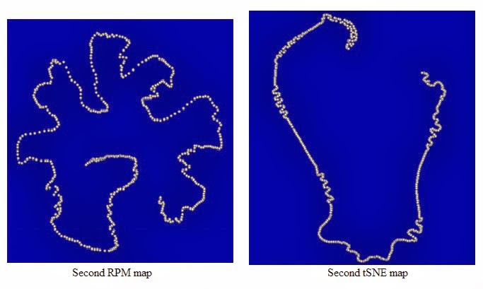
Above maps show apparent similarity with the maps in previous picture. Thus, we have here strong evidence that the geometrical characteristics in these maps correlate with characteristics in the initial sample picture. We can see such correlation more clearly when exam how regions of the map represent sections in the sample picture. The following picture shows how some sections of the tSNE map correspond to sections in the sample picture:

We notice that MDS maps topologically have simple sequential structure, so no information are embedded into the topological structure. MDS maps rather carry information through geometrical characteristics. For instance, a section of smooth curves; a large arch; a section of points with less density; etc.; Also, two distant sections winding together in particular way may indicate special feature of the underlying data. Furthermore, when we use 3D MDS maps, those secondary structure over the sequential structure may reveal much more rich complex information about the high dimensional data. Thus, MDS maps may offer new ways to describe and analyse the initial picture.
We might ask here: why are the MDS maps of the picture sequential? To answer this question, let's image that we scan the picture from top to bottom, line by line, and store the line in a vector, then this vector will gradually change from one line to the next line. Thus, this line vector manifest a kind random-walk in the high dimensional space mostly with relatively small steps. Those random-walk alike datasets exist in many areas of data analysis. For instance, a while ago I have blogged about one such case where the state of the whole stock market has been considered as an random-walk process. We notice also that the MDS maps shown above resemble, more or less, those map in the blog self-similarity of high dimensional random-walk.
The following picture shows the price history of S&P 500 components for a year, and the corresponding RPM map where each dot represents the state of the stock market at a day:

One interesting question arises in view of above picture is: Can we produce 2D picture (maybe not as nice as the photo of Lena but with easier recognizable features) out from a high dimensional dataset like the S&P 500 dataset? The answer is pretty much positive, and I'll blog about this in another post where I will talk about about multidimensional sorting.
At last, the sample picture and maps in this blog is produced by VisuMap version 4.0.895 and the sample dataset can be downloaded from the link here. The following short video shows some basic steps to apply mentioned services:

