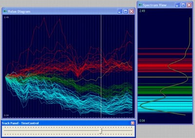
We have just released a short video clip that shows how VisuMap visualizes dynamics in time series data. This demo uses a feature of the spectrum view that
smoothly changes the display from one configuration to another one. This video is inspired by the some samples from
google data explorer. It is amazing how human eyes can quickly capture such characteristics like speed and variations if the data is properly visualized.
This video uses some features in VisuMap available in VisuMap version 3.2.855. The sample datasets used in the video are included in the standard installation of VisuMap.


