Thursday, November 4, 2010

Visualizing dynamics in time series data.

We have just released a short video clip that shows how VisuMap visualizes dynamics in time series data. This demo uses a feature of the spectrum view that smoothly changes the display from one configuration to another one. This video is inspired by the some samples from google data explorer. It is amazing how human eyes can quickly capture such characteristics like speed and variations if the data is properly visualized.

This video uses some features in VisuMap available in VisuMap version 3.2.855. The sample datasets used in the video are included in the standard installation of VisuMap.


Monday, October 4, 2010

Principal Components Analysis (PCA) of Random Walk Process

One sample dataset distributed with the VisuMap software package is the normalized weekly stock price history of 500 S&P stocks for the year 2002. This dataset as shown in the following picture can be considered as 500 time series for about 50 time points (i.e. weeks).


Picture 1

While above picture shows some common trend (like the large downturn in middle of the year), the price development is predominately random. How can we characterize this randomness? Well, one way to model the randomness is considering the stock price developments as independent random walk processes: Assuming that you have invested one dollar in each of the 500 stocks, their values will change more or less randomly from week to week for a small percentages. As a reference model we can generate 500 such random walk process with the following JavaScript code (as supported by VisuMap):

var randomWalk = New.NumberTable(500,50);
for(var row=0; row < randomWalk.Rows; row++) {
var v = 1.0;
for( var col=0; col < randomWalk.Columns; col++) {
randomWalk.Matrix[row][col] = v;
v *= 1 + 0.01*(Math.random() - 0.5);
}
}
randomWalk.ShowValueDiagram();
The last line in above code block creates the following diagram (the diagram has been colored with k-mean algorithm):

Picture 2

Comparing Figure 1 and 2, we can say that Figure 2, more or less, resembles Figure 1 if we remove some common trends from Figure 1 (i.e. de-
trending the down-turn in the middle and the overall slightly down-wards trend). The resemblance is however a collective similarity. It
does not make sense to find similarity between individual curves in the two figures.

Another way to compare two sets of time series is using principal components analysis (PCA). Among many other services, PCA provides a systematic way to decompose high dimensional variances in a dataset into many 1-dimensional directions. These directions (called principal components) are also ordered in the way, so that the beginning components have larger variance and therefore more information. Thus, PCA might be interesting way to characterize the variance (i.e. some kind of randomness) in a dataset.

It is very simple to visualize the PCA components with VisuMap. To do so, we just need to open the PCA view and open the Projection Analyzer window. Then select some PCs and choose the context menu "Show PCAs". The following two picture shows the first 24 PCs of the S&P500 and the RandomWalk datasets:

Picture 3


Picture 4

We can clearly see some similarity between the first few PCs in above two pictures. This indicates that random walk process models pretty well the major variance directions of the S&P dataset. The discrepancy between the PCs in above two picture may be used to characterize how the S&P price history differs from random walk process. In this way the random walk process is used as a null-space reference model.

Looking at Picture 4 we can also notice an interesting thing: the PCs clearly resembles the curves of sine functions. This is actually not too surprising since the PCA algorithm is basically a sequence of high dimensional rotation operations, which, as we know, lead to a lot of sine/cosine functions. Nevertheless, it would be interesting to determine the exact mathematical formula for the random walk process. By doing so, we can have a quick statical approximation for PCAs of many random walk alike datasets.


Sunday, July 18, 2010

Visualizing linkage disequilibrium clusters of genotype SNPs

SNP and Linkage Disequilibrium

I have just released a sample dataset Haplotype Analysis that shows how to use VisuMap to visualize clusters among SNPs (single nucleotide polymorphism). SNPs are about 0.1% of base-pairs locations in DNA sequences that vary from population to population; and from individual to individual. It has been said that the difference of many phonetic traits, like height, eye color, etc, of human beings can be attributed to variations of SNPs.

Haplotype analysis aims to find correlation between SNPs and phonetic traits. One of the often used method in haplotype analysis is the concept linkage disequilibrium (LD) that measures the correlation between SNP pairs with respect to a population. In abstract terms, LD induces an information structure over SNPs. Such a relational structure may offer a helpful framework to study the correlation between SNPs and phonetic variations.

The numerical calculation of LD is actually pretty straightforward. But all descriptions about LD I can find are too vague for step-by-step calculation. For the sack of reference, I will briefly describe the way how LD is calculated here. Assuming that we have obtained the genotype data about two SNPs, SNPa and SNPb, for a group of individuals I1, I2, I3, ..., Ik as in the following table:


I1 I2I3...Ik
SNPaT/TG/TT/T...G/G
SNPbC/TC/CC/T...T/T


Notice that each element in above table is a pair of nucleotides A, C, G or T. For certain reason (which I don't know), all SNPs are bi-allelic, that means each row in above table will only have maximal two different nucleotides. So, in above sample, SNPa has G and T, whereas SNPb has C and T. In order to calculate LD between the two SNPs, we first select a nucleotide arbitrarily from each row; and then count how many times that nucleotide appears in that row in each column. For instance, if we have selected T and C for SNPa and SNPb respectively, we will get a frequency table as following:


I1 I2 I3 ...Ik
SNPa2 1 2 ...0
SNPb121...0


The LD between the SNPa and SNPb (more accurately the R-Squared LD) is then defined as the squared value of the linear correlation coefficient between the two frequency rows. Notice that since the SNPs are bi-allelic, the final LD value won't depend on which nucleotide we have selected from each row for the calculation. We can verify this easily based on the formula below. More formerly, let {a1, a2, a3, ..., ak} and {b1, b2, b3, ..., bk} be the two frequency row vectors in above table; let a and b be their mean values; then the R-Squared LD between SNPa and SNPb is defined as following:


The Sample Dataset

The uploaded sample dataset is obtained from the HapMap Project website that provides accesses to a large collection of genotype datasets. More interestingly, from that website we can select genotype data for special SNPs and populations. To generate the sample dataset I have select all SNPs from the region of the first 2 Million base pairs in the 9-th chromosome for the CEU population that consists of 169 individuals. There are altogether 1900 SNPs in the selected region. Our sample dataset is thus basically a table with 1900x169 nucleotide pairs.

In order to import the downloaded data into VisuMap we have implemented a plugin module HaploExplorer that enables users to import data downloaded from the HapMap website (files must have the extension .hmap.) The HaploExplorer plugin also implements a special metric named "LD R-Sqaured", so that users can simply select this metric to generate maps to visualize LD values. The following picture shows a sphere map of the 1900 SNPs:


In above map, each glyph represents a SNP from the dataset. The size of the glyph indicates the chromosome location of the SNP, ie. smaller glyphs represent SNPs located at the beginning of the chromosome. Most importantly, the distances between the glyphs indicate the LD between the SNPs; that means closely located glyphs correspond to SNPs with high LD. We can see clearly various type of clusters in above picture.

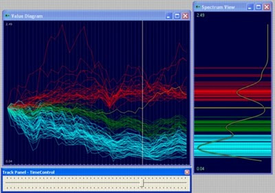
We can also visualize the chromosome locations more directly with the help a spectrum view. The following picture shows, for instance, a 2D-RPM map of the the dataset together with a spectrum view of their chromosome locations:


When interactively exploring about views, the user can select a group of SNPs in the lower window, the upper spectrum window will automatically show the chromosome locations of the selected SNPs.

For comparison purpose the HapMap project recommends a program called Haploview that allows user to directly visualize LD values with a triangle matrix, where the LD values are represented by different levels of gray colors. The following picture shows such a map generated by Haploview:

In above picture, all 1900 SNPs are sequentially lined up to the upper edge, so that the matrix is basically a 1900x1900 triangle matrix. In order support exploration of such large matrix Haploview implements an overview window (displayed on the lower left corner) that allows users to select a small section of the data for close investigation.

Comparing above maps, we can see that VisuMap provides a more direct and intuitive way to visualize patterns among SNPs. More importantly, as an integrated software package, VisuMap offers simple framework to investigate different type of LD relationships between SNPs. We can, for instance, easily experiment with any other comparable distance metric available in VisuMap; and we can use any of clustering algorithms in VisuMap to cluster the SNPs.

At last, but not at least, after we have imported the data in to VisuMap, we can also visualize patterns among populations by transposing the dataset table. In order to study relationships between individuals or populations a special distance metric, called the IBS (identity-by-state) distance, has been suggested by some researchers. The IBS distance metric is also implemented in the HaploExplorer plugin. After we have transposed a SNP dataset, we can select the IBS distance metric to produce population maps.


Thursday, March 18, 2010

Spherical Multidimensional Scaling in RPM way

We have just released VisuMap version 3.0.844. In addition to many enhancements (like the map gallery view), this release includes the implementation of a new kind of MDS algorithm, called the manifold RPM algorithm. Manifold RPM works similarly as the original RPM (relational perspective map), except that it maps data to different 2-dimensional surfaces.

The manifold RPM service in this release supports following surfaces as image space:
  • Flat real projective plane.
  • Flat klein-bottle
  • Flat sphere;
  • 3D-sphere.
Whereas the first 3 image spaces so far didn't seem to produce significantly new results, the
3D-sphere surface (also termed as S2) has produced surprisingly good results.


The spherical RPM often produced better results than the original toroidal RPM in the sense
that spherical RPM maps often have less ad-hoc fragmentations. The main reason for this improvement is probably because that 3D-sphere is more symmetrical than torus. Flat torus is symmetrical in shifting (isometric), but not symmetrical in rotation (isotropic), so that some directions are treated differently as I have once blogged. Obviously, 3D-sphere is both isometric and isotropic.

From the point of view of MDS (multidimensional scaling), the spherical RPM algorithm
basically replaces the distance metric by angle metric in image space. Although many trigonometrical calculation are invoked in the algorithm, the implementation of the algorithm has turned out to be significantly faster than the original RPM algorithm.

The major disadvantage of the sphere map is that 3D sphere maps is a little difficult
to explore on 2D computer screens or printed papers. In this release we have implemented a 3D viewer, the sphere view, to help people to explore 3D sphere maps. With the growing popularity of tools like Google Earth, I hope people will find a easy and useful tool in sphere viewer. The following link is a short video demonstrating the 3D sphere viewer implemented in VisuMap: